With the holiday season upon us, this blog is probably going to get very...uh, techy, with all the video game stuff coming out, so I thought I would post something a bit more literary before all that comes up. This is another YouTube inspired video (there's gonna be a lot more of these in the future- I think they're good for getting ideas to write about), but this time I got the idea from Sanne of Books and Quills. I'm not going to rank them, for one- because I find it really difficult to definitively rank things, and two, sometimes I just want to share things with people without making it some kind of contest. Anyway, here are some books/series that I really like the art style and/or the design of the cover and spine. To be honest, it's mainly about book series, but there are a couple standalone books in there
The Sword of Truth series by Terry Goodkind

This is not because Terry Goodkind is one of my favorite authors, but it certainly makes the experience of reading his books more enjoyable. Even though the design is pretty simple, in this case I just like the art that is on the covers. My favorite ones of the series are "Wizard's First Rule", "Stone of Tears", "Soul of the Fire", "Faith of the Fallen", and "The Pillars of Creation". After book 7, the artwork got really boring- I think they hired a different person. I will say that as much as I like the covers, I do think that they could have done a better job of designing the spine. The publishing company basically copied the cover for the spine- it has the same picture on it, but smaller. Not that that's necessarily bad, it's just...well, boring.
The Wheel of Time Series by Robert Jordan
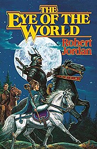
This is another one of my favorite authors, but where Goodkind's art kind of lacks, Jordan's cover art shines. The art is very good, but my favorite part is that the whole books is one art piece. By that I mean that the art wraps around the whole book, so the spine and the back side are just as interesting. The main characters might be on the front cover looking awesome, but on the back side, you might see some shady characters following them, watching in the shadows. Very cool. I love all of these covers, there isn't a single one I don't like.
The Legend of Drizzt series by R.A. Salvatore

The art of this series is also very well done, and like The Wheel of Time series, there's unique art on the back side as well. Is it just me, or do fantasy (and to some extent, sci-fi) have the best book art in literature? A lot of other book genres have good book design, but the art to me isn't always as good (there will be an exception to this later in the list though). My favorites from this series (of the ones that I own- there's a LOT of these books now) are "Exile", "Sojourn", "The Crystal Shard", and "Streams of Silver".
The Children of Húrin by J.R.R. Tokien

Here we go- finally a single novel and not a series! This is the only book of Tolkien's that I have where I like the book art for. As much as I love Tolkien's books, I seem to have all of the ugly versions of it, and still haven't replaced my movie tie-in copies of The Lord of the Rings (gasp!). I'll definitely upgrade in the future, but for now I'll just have to make do. How can you not like the art of this book!? It was done by Alan Lee himself! I shouldn't have to explain myself further.
The Chronicles of the Cheysuli series by Jennifer Roberson

This series was originally eight books, but I have the omnibus edition, which pares it down to 4 books- each with two of the original books inside. This series, and this author for that matter, should be getting a lot more attention than what it has been receiving. They're wonderful books and I highly recommend that you pick them up if fantasy lit. is your thing. Anyway, I like the artwork of these books (duh, that's why this is on the list!), but I don't really have a good reason for it... I just do.
The Harry Potter Series by J.K. Rowling

This may be a little weird, but as good as the cover art for the Harry Potter books is, the main reason I like them (other than the incredible writing of course!) is the design for the spines. I have the full set- I think it's called the treasure box set? The front cover art is good, especially for The Goblet of Fire (which also happens to be my favorite book in the series). What I like about the spines is that they have a cool diamond patter, almost argyle-like in complementary colors. The spine for The Half-Blood Prince for example has diamonds of forest green down the middle, and the sides are of a more lime/avocado color.
The Iliad & The Odyssey by Homer


Now for these two books, I'm talking about the Penguin Classics Deluxe Edition- the ones translated by Robert Fagles. Mainly I just like the design and the color scheme of the covers. The art on the top half of the book is cool, but mainly I just like the combination of the blue, white, and beige parts of the cover. That, and I feel like they make my bookshelf look a bit more sophisticated. I'm not really sure why- I just do.
The Nathaniel Starbuck series by Bernard Cornwell

Even though there's about 6 different fonts on the cover of these books, I still like them. The pictures behind the text are cool as well as give it a more "old-timey" feel for lack of a better description. The gold behind the title also makes it stick out against the brown and black background (it looks kind of brown in the picture, but it's really more of a gold color in person). My favorite cover in this series is for book three, which is called "Battle Flag"- pictured above. The red and blue really pop out at you in comparison to the otherwise dark background. Really cool covers!
Agincourt by Bernard Cornwell

Honestly, whoever Bernard Cornwell and/or his publishing company gets to do the cover art for his novels is freaking amazing! You should really check out his books, for both the art and the awesome writing! I like the close-up of the knight's armor, but (it might be too small to see here) there's also flecks and blotches of red all over the cover and the spine, making it look like it was sprayed with blood, which I think is a cool effect.
Borders Classics/Barnes & Noble Classics


A lot of people have the Penguin Classics or Oxford Classics books, but I have been buying the Borders Classics and the Barnes & Noble Classics series (since Borders went out of business). I do like the Borders Classics a little more in their design, like the fact that the author's name at the bottom looks handwritten, and the two different pictures that give it texture. Other than that, they're pretty similar. They both have a colored bar where the title of the book goes, and a cool work of art that applies to the story itself. Hopefully one day I'll be able to have a full set, minus the authors I would never read (*cough*Bronte & Austen*cough*).
No comments:
Post a Comment